The Tyro React Native component can be customized during the initialization of the <TyroProvider /> to match the look and feel of your site, by using the theme and styleProps configuration properties.
Fast track your integrations appearance by selecting one of our provided themes.
To fine-tune individual properties of the visualization, you can use style properties. Style properties will override theme properties.
When using styleProps the following property rules apply, any property that is irregular will be ignored.
- Any colors, such as background or text, require a Hex color code e.g. "#FFF" or "#FFFFFFF"
- Sizes such as font, border and size, require a numeric representation but can be supplied as a string e.g. "10" or 10
- Padding and margins currently only support numeric representation e.g. "10" or 10
- Font weights are per hundred similar to HTML markup specifications e.g. "400", "800" or 800
// example javascript code for using styleProps in the TyroProvider component
import { TyroProvider } from "@tyro/tyro-pay-api-react-native";

const theme = 'default';

const styleProps = {
  bodyBackgroundColor: '#f2f2f2',
  bodyPadding: 10,
  inputFontSize: 16,
  showSupportedCards: false
}

function App() {
  return (
    <TyroProvider
      options={liveMode: false, theme: theme, styleProps: styleProps}
    >
      // Your App Checkout Code wrapped here
    </TyroProvider>
  );
}An optional string to load a set of preset styleProps. Defaults to default.
An optional object containing properties for customizing the appearance of the widget.
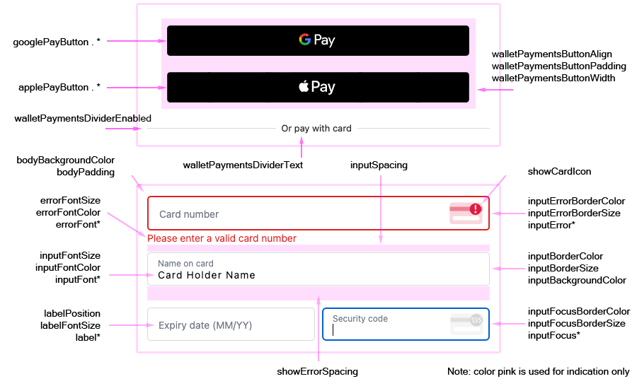
Border radius of the Apple Pay button.
Style of the Apple Pay button. Defaults to black.
Type of the Apple Pay button. Setting this property will add text to the Apple Pay button based on the type chosen. Defaults to plain.
Style of the Google Pay button. Defaults to default.
Type of the Google Pay button. Setting this property will add text to the Google Pay button based on the type chosen. Defaults to buy.
Optional text to show in the wallet payments divider. Default is "Or pay with card". Empty is allowed.
Optional flag to enable or disable the wallet payments divider. Defaults to true.
Optional width property for the wallet payments buttons.
Optional margin property for spacing around the wallet payment buttons. Defaults to 8px.
The background color of the widget.
The padding around the widget.
The width of the iframe. Defaults to 100%.
The minimum width of the iframe. Defaults to 500px.
The maximum width of the iframe. Defaults to 780px.
The font family of all text inside the widget. Supports custom fonts. Defaults to system font.
The background color of an input field.
The border color of an input field.
The border thickness of an input field.
The border radius of all corners of an input field.
The font color of text inside an input field.
The font size of text inside an input field.
The font weight of text inside an input field.
The font color of text inside an input field when it is in an invalid state.
The border color of an input field when it is in an invalid state.
The border thickness of an input field when it is in an invalid state.
The background color of an input field when it is focused.
The border color of an input field when it is focused.
The border thickness of an input field when it is focused.
The font color of text inside an input field when it is focused.
The padding inside an input field.
The amount of vertical space between inputs, irrespective of error messages.
The label position relative to the input field.
The font color of a label. labelPosition must = block for this to have effect.
The font size of a label. labelPosition must = block for this to have effect.
The font weight of a label. labelPosition must = block for this to have effect.
The padding inside a label. labelPosition must = block for this to have effect.
The background color of an error message.
The font color of an error message.
The font size of an error message.
The font weight on an error message.
The padding inside an error message.
Will display a visual aid card brand icon, and security code helper icon in the respective inputs. Defaults to true.
Reserves space equal to the size of the error message under each field. Defaults to true.
Will show a list of supported card types. Defaults to true.